In today’s data-rich environment, dashboards are everywhere. From tracking sales performance to monitoring website traffic, they promise to distill complex information into easily digestible insights. But let’s be honest: not all dashboards are created equal. You’ve probably seen your share of cluttered, confusing, or downright useless ones. So, what exactly separates a great dashboard from a mediocre one?
A good dashboard isn’t just a collection of pretty charts. It’s a powerful communication tool designed to provide clear, actionable insights at a glance. It should guide its audience, tell a compelling data story, and empower informed decision-making without requiring a data scientist to interpret it. This guide will walk you through the core principles that define good dashboard design, helping you transform your data into a truly effective visual asset.
Whether you’re building in Google Sheets, Google Looker Studio, Tableau Public, or any other tool, understanding these principles is key to crafting dashboards that truly work. Let’s dive in.
Table of Contents
- Why Dashboards Matter (and Why Good Ones Are Rare)
- The Core Principles of Good Dashboard Design
- Common Dashboard Mistakes to Avoid
- Building Your Good Dashboard: A Process
- Elevate Your Dashboard Skills
Why Dashboards Matter (and Why Good Ones Are Rare)
Dashboards serve as the nerve center for many operations. They centralize information, allowing users to monitor performance, identify trends, and spot anomalies much faster than sifting through raw data.
However, the sheer ease of creating charts in modern tools often leads to an “everything but the kitchen sink” approach. This results in overcrowded, confusing visuals that fail to deliver real value. A truly good dashboard acts as a strategic asset, guiding users quickly to the information they need to make decisions. It’s a tool for understanding, not just displaying, data.
The Core Principles of Good Dashboard Design
Crafting a good dashboard requires thoughtful planning and adherence to established principles. Here are the foundations:
1. Define Purpose and Audience
This is the absolute first step. Before you even think about charts, ask yourself:
- What specific question(s) should this dashboard answer? (e.g., “Are our sales targets being met?”, “Which marketing channels are most effective?”)
- Who is the primary audience? (e.g., Executives, marketing team, customer service reps?)
- What decisions will they make based on this dashboard?
Understanding your audience’s needs and the dashboard’s purpose dictates everything from the metrics you include to the chart types you choose. An executive dashboard, for instance, needs high-level summaries, while an analyst’s dashboard might require drill-down capabilities.

2. Embrace Simplicity and Clarity
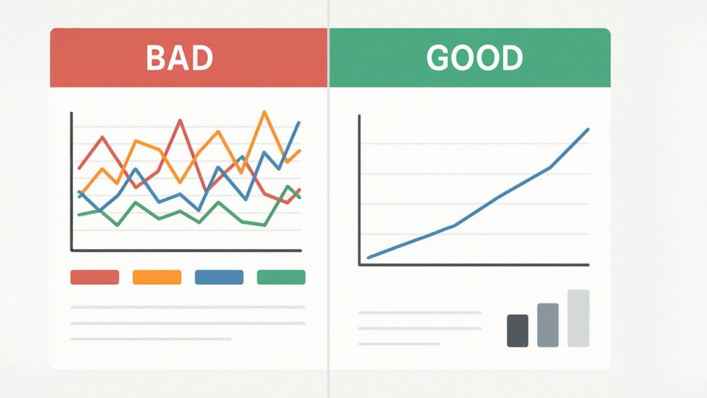
Less is often more. A good dashboard design avoids clutter and focuses on communicating one core message per screen or section.
- Avoid “Chart Junk”: Get rid of unnecessary visual elements that don’t add value (e.g., excessive gridlines, distracting 3D effects, overly complex backgrounds).
- Use White Space: Give your visuals room to breathe.
- Keep it Concise: Use clear, brief titles and labels.
The goal is immediate understanding, not decoding.

3. Prioritize Key Metrics (KPIs)
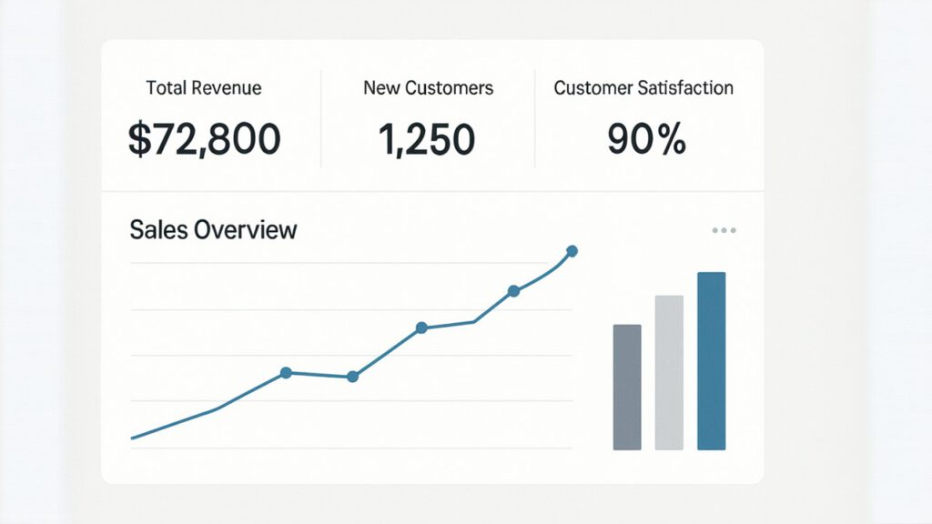
Not all data points are equally important. A good dashboard prominently features Key Performance Indicators (KPIs) that are most relevant to its defined purpose.
- Focus on Actionable Metrics: Show metrics that users can actually influence.
- Group Related Information: Organize metrics logically, perhaps by theme or workflow.
- Provide Context: Is a number good or bad? Show comparisons (e.g., vs. last month, vs. target).
4. Choose the Right Visuals
Selecting the appropriate chart type is fundamental to effective communication.
- Bars for Comparisons: Ideal for comparing categories or discrete periods (e.g., sales by product category, monthly revenue).
- Lines for Trends: Best for showing how a value changes over a continuous period (e.g., website traffic over time).
- Pies for Proportions (Use Sparingly): Only use for showing parts of a whole, and only when you have very few categories (2-5). Often, a bar chart is a better alternative for comparing proportions.
- Maps for Geographic Data: Perfect for visualizing data across locations (e.g., customer distribution).
For a deeper dive into chart types, check out our Beginner Data Visualization Guide: Learn the Basics in Google Sheets.
5. Ensure Data Accuracy and Integrity
A beautiful dashboard with flawed data is worse than no dashboard at all. Trust in the data is paramount.
- Clean Data: Ensure your underlying data is accurate, consistent, and free of errors. Dirty data leads to misleading insights.
- Clear Data Sources: Be transparent about where the data comes from and when it was last updated.
- Regular Updates: Ensure the dashboard data is refreshed as frequently as needed for its purpose (daily, weekly, real-time).
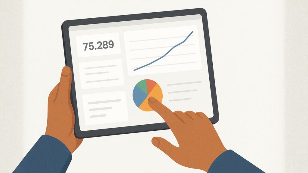
6. Optimize for Interactivity and Exploration
While simplicity is key, good dashboards also allow for deeper exploration if needed.
- Filters: Enable users to filter by date range, product, region, etc.
- Drill-downs: Allow users to click on a high-level metric to see more granular details.
- Tooltips: Provide additional information when a user hovers over a data point.
Tools like Google Looker Studio (formerly Google Data Studio) excel at creating highly interactive dashboards. Learn how in our Step-by-Step: Creating a Dashboard in Google Data Studio guide.

7. Maintain Visual Consistency
Consistency in design elements creates a professional and coherent look.
- Consistent Color Palette: Use colors purposefully to highlight, differentiate, or categorize. Avoid a rainbow of colors.
- Consistent Fonts and Sizing: Maintain a uniform look for titles, labels, and text.
- Consistent Layout: Arrange elements logically and predictably across different sections or pages of your dashboard.
8. Drive Actionability
Ultimately, the best dashboards inspire action. They don’t just show data; they provoke thought and encourage decisions.
- Highlight Key Takeaways: Use annotations or brief text boxes to point out critical insights or anomalies.
- Suggest Next Steps: Sometimes, a dashboard can subtly suggest what a user should do based on the data.
- Answer the “So What?”: Ensure the data’s implications are clear.
Common Dashboard Mistakes to Avoid
Even with the best intentions, it’s easy to fall into common traps:
- Information Overload: Trying to fit too much on one screen. This leads to visual noise and user overwhelm.
- Ignoring the Audience: Building a dashboard for yourself, not for those who will use it.
- Misleading Visuals: Using inappropriate chart types or skewed scales (e.g., a Y-axis not starting at zero) that distort the data.
- Lack of Context: Presenting numbers without benchmarks, goals, or historical comparisons.
- Poor Performance: Dashboards that load slowly or are buggy will quickly be abandoned.
- No Clear Call to Action: Data without direction is just information, not insight.
Building Your Good Dashboard: A Process
Creating a truly effective dashboard isn’t a single event; it’s a process:
- Plan: Define purpose, audience, and key metrics. Sketch out the layout on paper or a wireframe.
- Gather & Prepare Data: Ensure your data is clean, accurate, and structured appropriately.
- Design & Develop: Start building your dashboard using your chosen tool. Begin with the most important metrics and build outwards.
- Iterate & Refine: Share a draft with your target audience. Gather feedback and make improvements. Don’t be afraid to experiment!
- Test: Rigorously test all interactivity, filters, and data connections.
- Deploy & Maintain: Once live, monitor its usage and continue to refine it over time based on evolving needs.
Elevate Your Dashboard Skills
Understanding these principles is your first step towards creating truly good dashboards. But the learning doesn’t stop here.
- Explore Tools & Templates: Dive into our guide on Data Visualization Tools & Templates: Your Guide to Visual Insights to find the right software for your needs.
- Master Specific Visuals: Learn more about different chart types in our Data Visualization Glossary and practical guides.
- Learn from Others: Look for examples of excellent dashboard design. Many communities share their work online.
- Practice: The more you build, the better you’ll become.
By consistently applying these principles, you’ll transform your dashboards from mere data displays into indispensable tools that drive understanding, facilitate communication, and empower effective action within your organization.
Ready to start building more effective dashboards? Browse Our Data Visualization Templates for a head start, or sign up for our Newsletter for the latest tips and insights.

