
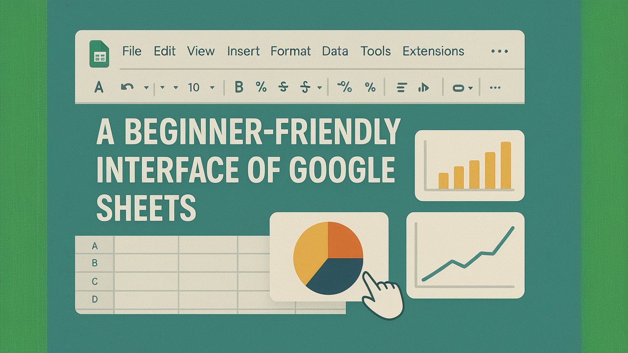
In our increasingly data-driven world, the ability to understand and interpret information is more crucial than ever. For many, complex spreadsheets filled with numbers can seem daunting. However, you don’t need to be a data scientist or a seasoned programmer to unlock powerful insights. This Beginner Data Visualization Guide focuses specifically on leveraging Google Sheets, an accessible and free online spreadsheet application, to transform your raw data into clear, compelling, and understandable visuals. You will learn the foundational principles and practical steps to begin your journey in Google Sheets data visualization right here.
Google Sheets offers an intuitive environment for creating basic yet highly effective charts and graphs. This guide will meticulously walk you through the essential concepts of Google Sheets data visualization. Furthermore, it will provide clear, step-by-step instructions for creating common chart types directly within Google Sheets. Our aim is to demystify the entire process, empowering you to tell your data’s story visually, efficiently, and with confidence.
Table of Contents
- Why Visualize Data with Google Sheets?
- Preparing Your Data for Visuals in Google Sheets
- Common Chart Types in Google Sheets
- Step-by-Step: Building Your First Chart
- Customizing Your Google Sheets Charts
- Effective Visualization Practices for Beginners
- Avoiding Common Charting Errors
- Advancing Your Data Visualization Skills
Why Visualize Data with Google Sheets?
The sheer volume of data available today can be overwhelming. Raw numbers, while precise, often fail to convey the full story. Google Sheets data visualization, however, serves as a powerful bridge. It translates complex numerical information into easily digestible visual formats directly within a familiar spreadsheet environment. This process yields several significant benefits:
- Clarity: Visuals simplify complex datasets, making patterns and relationships immediately apparent. Consequently, you can grasp insights far more quickly than by reviewing endless rows of data.
- Faster Insights: Our brains process images thousands of times faster than text. Therefore, a well-designed chart can reveal trends, outliers, and opportunities in mere seconds.
- Effective Communication: Visualizations are universal. Indeed, they allow you to present findings compellingly to any audience, regardless of their background, thereby ensuring your message resonates.
- Better Decision-Making: When data is presented clearly, decision-makers can quickly identify problems, assess performance, and formulate more informed strategies based on concrete evidence.
Ultimately, by mastering Google Sheets data visualization, you gain a critical skill for understanding and communicating effectively in any field.
Preparing Your Data for Visuals in Google Sheets
Before you embark on creating dazzling visuals, ensure your data is properly structured in Google Sheets. Clean and organized data is the bedrock of any accurate chart. This foundational step is crucial for successful Google Sheets data visualization.
- Structure Your Data: Organize your data in columns, with each column representing a variable (e.g., Date, Sales, Region). Each row, moreover, should represent a single record.
- Use Headers: Always include clear, descriptive headers for each column. These headers will serve as labels in your charts, thus making them easy to understand.
- Data Consistency: Ensure your data types are consistent within each column. For instance, keep all dates in a single format, and ensure numbers are formatted as numbers, not text. Google Sheets offers
Format > Numberoptions to assist with this. - No Blanks (Preferably): Fill empty cells with
0orN/Aif appropriate, or ensure your charting range accounts for them. Blanks, consequently, can sometimes lead to gaps or misinterpretations in charts.

Common Chart Types in Google Sheets
Google Sheets offers a variety of chart types suitable for different data stories. For beginners, mastering a few fundamental types is key to effective Google Sheets data visualization.
Column and Bar Chart Essentials
These charts are excellent for comparing discrete categories or showing changes over time when the number of periods is small.
- Column Charts: Display data vertically. They are ideal for showing changes over distinct periods (e.g., monthly sales).
- Bar Charts: Display data horizontally. They work well for comparing different items or categories (e.g., sales by product category). They are particularly useful when category names are long.
Line Charts for Trends in Google Sheets
Line charts are your go-to for visualizing trends over a continuous period, especially time. They effectively show how a value changes, rises, or falls.
- When to use: Tracking website visitors over several months, showing stock price fluctuations over days, or monitoring temperature changes over hours.
- Key takeaway: Lines emphasize movement and direction, making them perfect for trend analysis within Sheets.

Pie Charts for Proportions in Google Sheets
Pie charts represent parts of a whole. Each slice shows a proportion of the total.
- When to use: Ideal for showing market share, budget allocations, or survey responses for a limited number of categories (preferably 2-5).
- Caution: Avoid using too many slices, as they become difficult to compare accurately. Consider a bar chart for more categories, which is often a better choice for visualizing proportions when numerous.
Step-by-Step: Building Your First Chart
Let’s create a simple column chart using sample data in Google Sheets. This basic process applies to most chart types and is a fundamental step in Google Sheets data visualization.
- Enter Your Data:
- Open a new Google Sheet.
- In cell A1, type “Month.” Then, in A2, A3, A4, type “Jan,” “Feb,” “Mar.”
- In cell B1, type “Sales.” Subsequently, in B2, B3, B4, type “100,” “150,” “120.”
- Select Your Data Range: Click and drag your mouse to select cells A1:B4. This comprehensive selection includes your headers.
- Insert the Chart: Go to the menu bar at the top and click
Insert > Chart.- Google Sheets will automatically open the “Chart editor” sidebar on the right. Importantly, it will likely suggest a column chart, which is perfect for this example.
- Verify Data Ranges (in Chart editor):
- Under the “Setup” tab, ensure “Data range” is set to
Sheet1!A1:B4. - Check that “X-axis” correctly identifies “Month” and “Series” identifies “Sales.” If not, adjust them using the dropdowns.
- Under the “Setup” tab, ensure “Data range” is set to
Congratulations! You’ve successfully created your first basic Google Sheets data visualization!

Customizing Your Google Sheets Charts
Once you have a basic chart, Google Sheets provides extensive customization options in the “Chart editor” sidebar. These options are crucial for enhancing its clarity and visual appeal. Ultimately, they are key to transforming simple charts into impactful Google Sheets data visualizations.
- Access the “Customize” Tab: In the “Chart editor” sidebar, simply switch from the “Setup” tab to the “Customize” tab.
- Chart Style:
Chart style: Adjust background color, font, or add a border. These small tweaks can significantly impact visual presentation.Maximize: Check this box to make the chart fill the entire chart area more effectively, ensuring all available space is utilized.
- Chart & Axis Titles:
Chart title: Change the main title (e.g., “Monthly Sales Performance”). Make it descriptive.Horizontal axis title: Label your X-axis (e.g., “Month”). This provides essential context.Vertical axis title: Label your Y-axis (e.g., “Sales Revenue”). This clarifies the measured values.- Tip: Always make titles descriptive and concise for effective chart presentation.
- Series:
Color: Change the color of your bars/lines. Use brand colors or colors that thoughtfully evoke the data’s meaning.Data labels: Add specific values directly on top of your bars or points. This feature is very useful for precision and quick readability.Error bars/Trendline: For more advanced analysis, consider adding statistical elements like these.
- Legend:
Position: Place the legend (which explains what each color/line represents) where it doesn’t obstruct the data, typicallyToporRight.Font: Adjust legend font size and style for optimal readability.
- Horizontal/Vertical Axis:
Min/Max value: Set custom minimum and maximum values for your axes to control the scale. This setting is crucial for consistent comparisons across multiple charts.Gridlines: Adjust major and minor gridlines for visual cleanliness. Often, fewer gridlines lead to less clutter and a clearer focus on the data.
By strategically using these options, you can truly transform a default chart into a professional Google Sheets data visualization.
Effective Visualization Practices for Beginners
Creating genuinely effective data visualizations is both an art and a science. As you begin your journey with Google Sheets data visualization, consistently keep these fundamental best practices in mind:
Audience and Simplicity
- Know Your Audience: First and foremost, identify precisely who will see this chart. What specific questions do they need answered? Tailor your visualization to their unique needs and understanding. For instance, executives might require high-level summaries, while analysts might demand more granular detail.
- Simplicity is Key: Absolutely avoid clutter. Focus intently on conveying one main message per chart. Ruthlessly remove any unnecessary elements that do not add clear value to the data story.
Choosing and Labeling Charts
- Choose the Right Chart Type: Do not merely pick the default option. Instead, thoughtfully select a chart type that best represents your data and the specific story you intend to tell. Remember, bars effectively compare discrete items, lines compellingly show trends over time, and pies illustrate parts of a whole.
- Label Everything Clearly: Ensure your chart title, all axis labels, and legends are explicit, unambiguous, and easy to understand. Ambiguity, after all, can invariably lead to misinterpretation and confusion.
Purposeful Color and Context
- Use Color Purposefully: Employ color strategically to highlight important data points, clearly differentiate categories, or signify specific meaning (e.g., red for negative, green for positive). Conversely, avoid using too many colors, which can easily distract and overwhelm the viewer.
- Provide Context: Numbers rarely speak for themselves. Always add brief explanatory text, a concise subtitle, or helpful annotations to clarify key takeaways. Ask yourself: What does the data truly mean for your audience?

Avoiding Common Charting Errors
Even experienced users sometimes fall into common traps when creating visualizations. Being aware of these pitfalls will proactively help you create more effective charts in Google Sheets:
- Information Overload: A frequent mistake involves attempting to squeeze too much data or too many different chart types onto a single visual. This common error invariably results in a confusing and ineffective chart that fails to deliver insight.
- Misleading Scales: Starting a Y-axis at a value other than zero can dramatically exaggerate differences, inevitably leading to misinterpretations. Always strive to be transparent and intentional with your scales.
- Poor Color Choice: This includes using clashing colors, an excessive number of colors, or colors that are not colorblind-friendly. Such choices can unfortunately render the chart unreadable for a significant portion of your audience.
- Ignoring Data Quality: Attempting to visualize dirty or inconsistent data. Always thoroughly clean your data before you chart it; otherwise, your visuals will inevitably be inaccurate and unreliable.
- Defaulting to Pie Charts: Overusing pie charts, especially for too many categories or when comparing parts that are very similar in size, is a common pitfall. Bar charts are, in many cases, a superior alternative for comparisons.
- Lack of Actionability: Presenting data without clear implications or actionable insights represents a missed opportunity. A truly good visualization should ideally prompt questions or directly suggest tangible actions.
Advancing Your Data Visualization Skills
Mastering Google Sheets data visualization is an excellent and highly practical starting point. As you become more comfortable and confident with the basics, you can certainly explore advanced techniques and other powerful dedicated tools.
- Combine Charts: Learn how to create more complex visualizations, such as a Google Sheets Line Chart With Bars, to show multiple data types on one graph. This adds layers of information.
- Explore More Tools: Venture into dedicated Top 5 Free Data Visualization Tools that offer more advanced features and interactivity beyond what Sheets can do alone. This guide is, therefore, a great next step.
- Understand Key Concepts: Deepen your theoretical knowledge of data visualization principles.
- Dashboard Building: Transition from single charts to building comprehensive, interactive dashboards.
- Interactive Infographics: Learn how to build compelling narratives with dynamic elements.
Your journey into data visualization is truly just beginning. Google Sheets provides a solid, accessible foundation. Therefore, continue to practice, actively explore new techniques, and consistently refine your skills. You’ll soon be transforming any dataset into compelling, insightful, and memorable visual stories.
Alternatively you can sign up for our Newsletter to get the latest tips.