
Welcome to the comprehensive Data Visualization Glossary, your essential guide to understanding the language of visual data. In an era where information is abundant, the ability to interpret, create, and communicate insights through visuals is more critical than ever. Whether you’re a beginner just starting your journey into data analysis or a seasoned professional looking to refresh your terminology, this glossary provides clear, concise definitions for the most important terms in the field of data visualization.
This resource is designed to demystify complex concepts, making the world of charts, graphs, and dashboards accessible to everyone. From fundamental principles to advanced techniques, mastering these terms will empower you to speak the language of data fluently, enhance your analytical skills, and create more impactful visual stories. Dive in and expand your knowledge with our definitive Data Visualization Glossary.
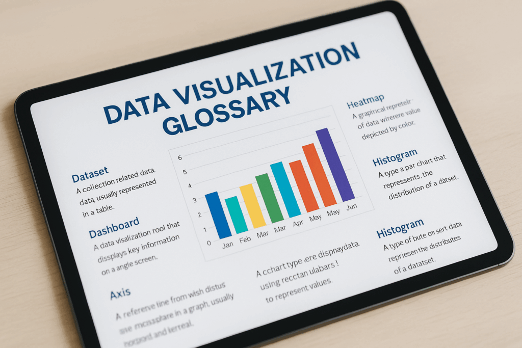
A-Z Data Visualization Terms
A
- Accuracy: The degree to which data and its visualization correctly represent the true values or relationships without distortion. Essential for a reliable Data Visualization Glossary.
- Aggregation: The process of combining data from multiple sources or rows into a single summary value (e.g., sum, average, count).
- Alias: An alternative name or label given to a data field or value, often used to simplify or clarify complex data for visualization.
- Animated Transitions: Visual effects that smoothly transform one chart state to another, often used in interactive visualizations to show changes over time (e.g., in tools like Flourish). Learn how these apply in Interactive Infographics.
- Annotation: Text or graphical elements added to a chart to provide additional context, highlight specific data points, or explain trends.
- Area Chart: A line chart with the area between the line and the x-axis filled with color, often used to show magnitude over time.
- Axis: A reference line that defines the scale and labels for a chart’s data points (e.g., X-axis for categories/time, Y-axis for values).
B
- Bar Chart: A chart that uses horizontal or vertical bars to represent and compare discrete categories of data. A fundamental concept in any Data Visualization Glossary. See examples in our Beginner Data Visualization Guide.
- Bar Chart Race: A dynamic, animated bar chart that shows how data changes over time, with bars growing and shrinking in real-time. Popularized by tools like Flourish.
- Big Data: Extremely large and complex datasets that cannot be easily processed or analyzed using traditional data processing applications.
- Bubble Chart: A variation of a scatter plot where data points are replaced with bubbles, and the size of the bubble represents an additional dimension of data.
C
- Call-to-Action (CTA): A prompt on a dashboard or visualization designed to encourage an immediate response or action from the user.
- Chart Junk: Any unnecessary or distracting elements in a chart that do not contribute to the understanding of the data, often hindering effective visualization.
- Choropleth Map: A map that uses different shades or colors to represent data values in geographical areas, such as countries or states.
- Clarity: The ease with which a viewer can understand the message or insights conveyed by a visualization. A key principle for a Good Dashboard.
- Color Palette: The set of colors used in a visualization, chosen to enhance readability, highlight data, and maintain consistency.
- Column Chart: A bar chart with vertical bars, commonly used to compare values across different categories or show changes over discrete time periods.
- Combo Chart: A chart that combines two or more different chart types (e.g., a bar chart and a line chart) to display multiple types of data on a single graph. Learn to create a Google Sheets Line Chart With Bars.
- Context: Background information or surrounding circumstances that help in understanding the meaning and significance of the data presented in a visualization.
- CSV (Comma Separated Values): A common file format for tabular data, where values are separated by commas, often used for importing data into visualization tools.
D
- Dashboard: A visual display of key performance indicators (KPIs) and data, designed to provide a quick, at-a-glance overview of business performance or specific metrics. A central term in this Data Visualization Glossary. See What Makes a Good Dashboard?
- Data Cleaning: The process of detecting and correcting (or removing) corrupt or inaccurate records from a dataset. Essential for accurate visualization.
- Data Point: An individual value or observation in a dataset, represented visually on a chart (e.g., a single bar, a point on a line).
- Data Storytelling: The art of communicating insights from data through a narrative, often using visualizations to make the story compelling and memorable. Explore how tools like Flourish aid in Mastering Flourish for Data Storytelling.
- Data Table: A tabular representation of data, often accompanying a chart to provide exact values or additional detail.
- Data Transformation: The process of converting data from one format or structure into another, often necessary before visualization.
- Data Type: The classification of data (e.g., number, text, date, boolean), which influences how it can be used in visualizations.
- Datawrapper: A popular online tool for creating simple, clean, and embeddable charts and maps, especially favored by journalists. See our Datawrapper Demystified Guide.
- Dimension: A categorical field in a dataset (e.g., Region, Product Category, Date) that is used to group or segment data.
- Drill-down: The ability to explore data in more detail by navigating from a summary view to a more granular view within a dashboard.
- Dual-Axis Chart: A chart that uses two independent Y-axes (vertical axes) to display two different measures that might have different scales on the same graph, often used in combo charts.
E
- Embed Code: HTML code provided by online visualization tools that allows you to insert a live, interactive chart or dashboard directly into a webpage.
- Exploratory Data Analysis (EDA): An approach to analyzing data sets to summarize their main characteristics, often with visual methods.
F
- Filter: A control on a dashboard or chart that allows users to narrow down the data displayed based on specific criteria.
- Flourish: An online tool known for creating dynamic, animated, and interactive data visualizations, particularly popular for “bar chart races.” Learn more in our Mastering Flourish for Data Storytelling guide.
G
- Gauge Chart: A chart that displays a single value against a range, similar to a speedometer, often used to show progress towards a goal.
- Google Looker Studio (formerly Google Data Studio): A free, web-based tool from Google that allows users to create interactive dashboards and reports from various data sources. See our guide: Step-by-Step: Creating a Dashboard in Google Data Studio.
- Google Sheets: A free, web-based spreadsheet program by Google, widely used for data organization and basic data visualization. Our Beginner Data Visualization Guide focuses on this tool.
- Graph: A visual representation of data, often used interchangeably with “chart.”
- Gridlines: Lines that extend from the axis ticks across the plot area of a chart, aiding in reading values.
H
- Heat Map: A data visualization technique that shows magnitude of a phenomenon as color in two dimensions.
- Histogram: A type of bar chart that shows the distribution of numerical data, grouping numbers into ranges (bins) and showing how many fall into each range.
I
- Infogram: An online tool for creating visually appealing infographics, charts, and maps with a focus on design and storytelling. See our Mastering Infogram Guide.
- Infographic: A visual representation of information or data designed to present complex information quickly and clearly. Explore how to build engaging Interactive Infographics.
- Interactive Visualization: A visualization that allows users to manipulate data, filter views, or drill down into details, rather than being a static image.
K
- Key Performance Indicator (KPI): A measurable value that demonstrates how effectively a company is achieving key business objectives. Central to a Good Dashboard.
L
- Legend: A key that explains the meaning of colors, symbols, or patterns used in a chart.
- Line Chart: A chart that displays information as a series of data points connected by straight line segments, ideal for showing trends over time. Featured in our Google Sheets Line Chart With Bars tutorial.
M
- Measure: A numerical field in a dataset (e.g., Sales, Profit, Quantity) that can be aggregated or used for calculations.
- Meta Data: Data that provides information about other data (e.g., the date a report was last updated).
- Moving Average: A calculation used to analyze data points by creating a series of averages of different subsets of the full data set, often used to smooth out short-term fluctuations in line charts.
P
- Pie Chart: A circular chart divided into slices, illustrating numerical proportion. Best for showing parts of a whole with a limited number of categories.
- Pivot Table: A data summarization tool found in spreadsheet programs that allows users to reorganize and summarize selected columns and rows of data to obtain desired reports.
R
- Responsive Design: A design approach that makes websites and visualizations render well on a variety of devices and screen sizes, from desktops to mobile phones.
- Root Cause Analysis: A process for identifying the underlying causes of problems or undesirable events, often facilitated by effective data visualization.
S
- Scatter Plot: A graph that displays values for two variables for a set of data by plotting individual data points, often used to show relationships or correlations.
- Schema: The structure or organization of a database or dataset, defining how data is related.
- Series: A group of related data points plotted on a chart, typically representing a single variable (e.g., “Sales” or “Profit Margin”).
- Sparkline: A very small line chart, typically drawn without axes or coordinates, that presents the general shape of the variation (typically over time) within some measurement.
- Stacked Bar Chart: A bar chart that divides each bar into segments, with each segment representing a different category, to show the composition of each bar.
- Static Visualization: A non-interactive chart or graph that presents data in a fixed image format.
- Sankey Diagram: A type of flow diagram in which the width of the arrows is proportional to the flow quantity, often used to visualize energy, material, or cost transfers.
T
- Tableau Public: A free data visualization software that allows users to create and share interactive dashboards and visualizations publicly. One of the Top 5 Free Data Visualization Tools.
- Template: A pre-designed layout or structure for a chart, infographic, or dashboard that can be easily customized with new data. Explore our DigView Templates.
- Time Series Data: Data points indexed (or listed or graphed) in time order, often visualized with line charts to show trends.
- Tooltip: A small pop-up box that appears when a user hovers over a data point in an interactive visualization, providing additional details or values.
- Trendline: A line superimposed on a chart to indicate the general direction or trend of the data.
- Typography: The style and appearance of printed matter, including font choice, size, and spacing, crucial for readability in visualizations.
U
- User Experience (UX): The overall experience of a person using a product, such as a dashboard or interactive visualization, encompassing ease of use, satisfaction, and efficiency.
V
- Variable: A characteristic or attribute that can be measured or observed, represented by columns in a dataset.
- Visualization: The graphical representation of information and data, the core subject of this Data Visualization Glossary.
This Data Visualization Glossary is a living document, and we will continue to expand it with new terms and concepts as the field evolves. We encourage you to revisit it often as you continue your journey in data analysis and storytelling.
For further learning, explore our guides on specific tools and practices:
- Get foundational knowledge with our Beginner Data Visualization Guide.
- Discover the Top 5 Free Data Visualization Tools.
- Learn what truly Makes a Good Dashboard.
- Explore our collection of DigView Templates.
- Sign up for our Newsletter for the latest updates and insights.