
Understanding data proves profoundly crucial in today’s dynamic and data-rich world. However, it is undeniable that not everyone possesses a programming background or the inclination to learn complex coding languages. If you are a dedicated marketer, a diligent business owner, an eager student, or simply an individual seeking to decipher complex numbers without writing a single line of code, you have indeed arrived at the ideal resource. Thankfully, the market is currently brimming with fantastic, highly accessible free data visualization tools. These powerful and intuitive tools specifically empower anyone, regardless of their technical expertise, to transform intricate, often daunting, datasets into clear, compelling, and actionable visual narratives.
This comprehensive guide will meticulously walk you through the top 5 free data visualization tools meticulously designed with non-programmers in mind. Initially, we’ll thoroughly explore the distinct attributes that truly make each tool stand out from its competitors. Furthermore, we will delve into practical, actionable insights regarding precisely how they can help you meticulously create insightful charts and dynamic dashboards. Ultimately, these diverse tools are perfectly suited for substantially enhancing your data storytelling capabilities without demanding a steep or frustrating learning curve. Consequently, they collectively provide a powerful and accessible bridge between raw, overwhelming data and crucial, actionable intelligence.
Why Use Free Data Visualization Tools?
The transformative power of visualizing data is, without question, undeniable. Indeed, it significantly helps you achieve several pivotal objectives that can drive better decisions and clearer communication:
- Spot Trends Faster: You can, for instance, quickly discern overarching patterns and uncover critical insights that might otherwise remain hidden within countless rows and columns of traditional spreadsheets. Complex datasets, consequently, become remarkably intuitive and significantly easier to interpret, leading to quicker understanding.
- Communicate Clearly: Present complex information in an easy-to-understand and visually engaging format. Visuals fundamentally simplify the core message, thereby making it accessible and digestible for any audience, irrespective of their technical expertise or prior data knowledge.
- Make Better Decisions: Base your strategic choices and subsequent actions on clear, irrefutable visual evidence. This data-driven practice consistently reduces guesswork, minimizes uncertainty, and actively supports more confident, profoundly informed business decisions.
- Save Money: Obtain robust, professional-grade analytical and visualization capabilities without the prohibitive burden of investing in expensive software licenses. This, in turn, genuinely democratizes powerful data analysis, making it available for individuals, small businesses, and even non-profits alike.
These free data visualization tools fundamentally democratize data analysis. Consequently, they put powerful capabilities directly into your hands. This means that more individuals and small businesses can effectively leverage their data to gain a significant competitive edge in their respective fields.

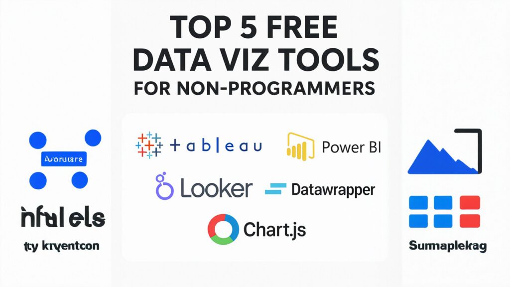
Our Top 5 Free Data Visualization Tools for Non-Programmers
Here are our carefully selected top picks. Each truly shines in terms of its intuitive usability, an impressive array of practical features, and the consistently exceptional quality of the visualizations you can effortlessly create:
1. Google Looker Studio (formerly Google Data Studio)
If you primarily operate within the expansive Google ecosystem, Looker Studio will undoubtedly become your indispensable go-to solution for data reporting and dashboard creation. It’s a completely free, web-based platform. This versatile platform specifically allows users to effortlessly create highly interactive dashboards and dynamic reports that bring data to life. Its drag-and-drop interface, moreover, is incredibly intuitive and remarkably user-friendly. Therefore, it stands as one of the very Top 5 Free Data Visualization Tools available for those truly new to the field, making complex data insights surprisingly accessible to a broad audience.
Key Features for Non-Programmers:
- Seamless integration occurs with widely used Google services such as Google Analytics, Google Sheets, Google Ads, and a multitude of other external data connectors. This significantly expands your data possibilities and dramatically simplifies data consolidation from disparate sources.
- A robust drag-and-drop report builder is readily available. Users can design sophisticated custom layouts with remarkable ease, even entirely without any prior coding knowledge.
- Pre-built templates are easily accessible to users, facilitating quick starts on various analytical projects. These templates provide a strong foundational structure for diverse reporting needs, thereby saving valuable time and effort.
- It includes interactive filters and comprehensive controls for audience exploration. Consequently, viewers can fully customize their data view for deeper, more personalized insights, substantially enhancing overall usability and engagement.
Best For: Creating powerful marketing dashboards, detailed website analytics reports, and effectively combining data from various online sources for a unified view.
Pro Tip: Looker Studio dashboards are live; consequently, your data updates automatically and in real-time, providing crucial and timely insights for prompt decision-making!
- Visit Google Looker Studio to confidently start building your very first professional report using these free data visualization tools.
2. Infogram
Infogram consistently excels at creating stunning, professional-looking infographics, versatile charts, and engaging maps. Indeed, it stands as one of the most visually driven free data visualization tools on the market today, prioritizing aesthetic appeal alongside data accuracy. Furthermore, it is perfectly suited for compelling storytelling and impactful presentations. Notably, you do not require any prior design experience to make your data look truly good and appealing to your target audience.
Key Features for Non-Programmers:
These **free data visualization tools** offer:
- It provides a vast library of highly customizable templates for infographics, comprehensive reports, and interactive dashboards. This offers tremendous flexibility for diverse projects and creative expression.
- An intuitive drag-and-drop editor allows effortlessly adding text, various chart types, and multimedia elements. This, consequently, significantly simplifies the entire content creation process.
- It robustly supports interactive charts and dynamic maps that you can seamlessly embed online. These interactive features, in turn, significantly enhance user engagement and facilitate deeper data exploration.
- Additionally, it is excellent for various visual content marketing purposes. You can easily create highly shareable and impactful visual assets that effectively capture audience attention across platforms.
Best For: Crafting engaging infographics for blogs, developing compelling social media content, preparing professional annual reports, and designing dynamic, visually rich presentations.
Pro Tip: Effectively utilize Infogram’s infographic templates to quickly transform inherently complex data into easily digestible visual summaries. This strategic approach saves considerable time and effort in the design phase.
- Explore a wide range of inspiring templates on Infogram’s official website for your data visualization needs.
3. Datawrapper
If your primary objective explicitly involves creating clean, embeddable charts and intuitive maps for journalistic pieces or detailed analytical reports, Datawrapper represents an outstanding choice among free data visualization tools. It justly earns renown for its exceptional simplicity of use and the consistently high quality of its visual output. This holds particularly true for generating clear static or subtly interactive visuals that convey information effectively.
Key Features for Non-Programmers:
- It is, remarkably, extremely easy to use: simply paste your raw data, thoughtfully choose a suitable chart type, and then confidently publish your polished visualization. The entire process is remarkably streamlined and highly efficient.
- It focuses intently on clarity and mobile-responsiveness. Your finished visuals will, therefore, consistently look great and function perfectly across virtually any device, from large desktops to small smartphones.
- It is highly effective for rapid chart creation for articles or blog posts. You can generate polished charts remarkably quickly for timely content dissemination and news reporting.
- Tooltips are automatically generated, significantly enhancing interactivity. Users consequently gain more granular and detailed information on demand with a simple hover action.
Best For: Developing clear charts for news articles, informative blog posts, academic papers, and straightforward, yet effective, data exploration.
Pro Tip: Datawrapper’s charts are highly optimized for web embedding and consistently look great on any device. This ensures broad accessibility and a consistent, positive user experience.
- Check out more inspiring examples and confidently start creating your own visualizations at Datawrapper, one of the best free data visualization tools.
4. Flourish
For dynamic, animated charts and truly sophisticated data storytelling, Flourish distinctively stands out as a premier option in the landscape of free data visualization tools. It gains particular fame for its iconic “bar chart race” and other engaging animated templates. These templates effectively show how data changes and evolves over time in a captivating and deeply memorable way, ensuring your audience remains engaged.
Key Features for Non-Programmers:
- It offers an extensive and diverse template library for animated and highly interactive visualizations. This provides a myriad of creative options for crafting compelling data narratives.
- Easy data upload (from common spreadsheet formats) and intuitive customization are integral to its design philosophy. You can quickly bring your raw data to life with impressive and smooth animations.
- It consistently enables users to create compelling visual narratives that truly grab and hold attention. This ensures your data becomes memorable and resonates profoundly with your audience.
- Its web visualizations are both effortlessly embeddable and readily shareable. You can, therefore, easily distribute your impactful work across various digital platforms and social media channels.
Best For: In-depth time-series data analysis, powerfully illustrating historical trends, creating engaging presentations, and developing dynamic social media content that stands out.
Pro Tip: Experiment with Flourish’s unique “story” feature to combine multiple visualizations into a guided, sequential narrative. This effectively enhances overall impact and guides audience understanding step-by-step.
- Get started with impressive animations and interactive elements at Flourish, a top choice among free data visualization tools.
5. Tableau Public
Tableau consistently holds its prestigious position as an industry leader in professional data visualization. Significantly, Tableau Public offers a robust free version of its powerful software. While it might involve a slightly steeper initial learning curve compared to some of the other user-friendly tools mentioned, its immense power for deep data exploration and creating highly interactive dashboards is unparalleled. Indeed, it truly functions as one of the most powerful free data visualization tools available for aspiring data analysts aiming for professional-grade results.
Key Features for Non-Programmers (with some learning curve):
- It connects seamlessly to various common data sources (e.g., Excel workbooks, plain text files, Google Sheets). This capability expands your data integration possibilities considerably, allowing for diverse dataset analysis.
- It provides advanced chart types and sophisticated analytical capabilities. Users can, therefore, explore data deeply, uncover complex relationships, and perform intricate analyses.
- Users can confidently create highly interactive “vizzes” (visualizations) and comprehensive dashboards. This functionality enables dynamic exploration and fosters invaluable self-service analytics.
- You can easily publish and share your analytical work on the Tableau Public gallery. This public platform helps build your professional portfolio and gain significant visibility for your data analysis skills.
Best For: In-depth data analysis, building a public portfolio showcasing advanced data visualizations, and thoroughly exploring complex datasets.
Pro Tip: Take advantage of the vast community resources and extensive, high-quality tutorials readily available for Tableau Public. This will quickly accelerate your learning and proficiency, helping you master its advanced features and analytical power.
- Download Tableau Public directly from Tableau’s official website to explore these powerful free data visualization tools.
Getting Started with Free Data Visualization Tools
Choosing the right free data visualization tools truly depends on your specific needs and overarching project goals. For instance, if you primarily require simple, clear charts for a blog post, Datawrapper or Infogram might be perfect choices due to their simplicity and rapid output. Alternatively, for interactive dashboards capable of pulling live data, Google Looker Studio stands as a strong contender, offering seamless integrations with Google services. If you’re specifically seeking animated storytelling to captivate your audience, Flourish proves to be an excellent and dynamic option. Conversely, for more in-depth analytical exploration and building a professional portfolio, Tableau Public offers immense power and unparalleled flexibility.
All these free data visualization tools fundamentally empower non-programmers to unlock profound insights and tell compelling data stories. Therefore, do not be intimidated by data’s inherent complexity! Start exploring these accessible options today, and you can truly transform your raw numbers into impactful, understandable, and visually appealing visuals that resonate with your audience!
Beyond the Tools: Best Practices for Effective Visuals
No matter which of these free data visualization tools you choose, remember that the tool itself is only as effective as the underlying data and the thoughtful design principles applied. For truly effective and resonant visuals, always consider these paramount aspects:
- Your Audience: First and foremost, identify precisely who you are creating this visualization for. What specific information do they ultimately need to know? Tailor your visuals and their level of detail accordingly to meet their needs.
- Clarity: Is the message conveyed clearly and is it easy to understand at a single glance? This principle is absolutely paramount for rapid comprehension and immediate insight.
- Accuracy: Is your underlying data clean, demonstrably reliable, and are your calculations absolutely correct? Data integrity fundamentally underpins trust and ensures the validity of your insights.
- Storytelling: Does your visualization tell a compelling narrative or effectively answer a key question? Strive to actively engage your audience and guide them logically through your data’s insights.
For more on these essential principles, we strongly encourage you to check out our Data Visualization Tools & Templates for key terminology and definitions.